Bootstrap Chronicles: My Path to UI Framework Proficiency
05 Oct 2023UI Frameworks and Bootstrap
User Interface (UI) frameworks are sets of pre-written code, libraries, and tools designed to simplify and standardize the process of creating user interfaces for web applications. They provide a foundation of reusable components, styles, and functionality that web developers can leverage to build consistent, responsive, and visually appealing user interfaces efficiently.
Bootstrap, one of the most popular and widely used UI frameworks, is a robust and versatile tool that simplifies the process of creating modern and responsive user interfaces for web applications. It achieves this by reducing the need to write extensive CSS code. Instead, developers can streamline their workflow by attaching Bootstrap’s predefined class names to HTML tags, making it a highly efficient choice for web development.
Why bother with UI Frameworks?
Investing in UI frameworks such as Bootstrap 5 offers several compelling advantages for web developers. Firstly, it expedites development by offering a wealth of pre-built components such as navigation bars, containers, footers, and more. These components are optimized for a range of devices and browsers, significantly reducing the time required for coding and design.
Additionally, in today’s mobile-centric landscape, ensuring responsive design across various screen sizes is critical. UI frameworks are inherently designed with responsiveness in mind, simplifying the creation of websites that seamlessly adapt to smartphones, tablets, and desktops.
Furthermore, UI frameworks like Bootstrap 5 promote design consistency, a crucial aspect of a positive user experience. By providing predefined styles and guidelines, they ensure a uniform look and feel throughout the application, maintaining a polished and professional appearance.
Lastly, UI frameworks alleviate the challenges of cross-browser compatibility, a common source of frustration in web development. Bootstrap 5, for instance, has already addressed many of these issues, sparing developers from the headache of extensive testing and debugging. In summary, UI frameworks like Bootstrap 5 empower developers to work more efficiently while delivering responsive, consistent, and cross-browser compatible web applications.
My Journey with Bootstrap
My experience with Bootstrap has been nothing short of a roller coaster ride, marked by initial frustration and an ongoing quest for mastery. While I acknowledge the incredible potential of Bootstrap to streamline web development, my journey began with a rather negative encounter.
At the beginning of my journey, I struggled to grasp the syntax of Bootstrap. The learning curve seemed steep, and I found myself spending more time searching through the documentation for the right class names than actually coding. It was a frustrating experience that led me to question why I should invest my time in something that appeared to hinder my productivity rather than enhance it.
Adding to my initial frustration, there were moments when I doubted the existence of the precise class names I needed. These uncertainties left me torn between using Bootstrap or resorting to writing custom CSS, which I already understood. It felt counterintuitive to spend valuable time deciphering Bootstrap’s intricacies when I could achieve the desired results relatively easily using raw HTML and CSS.
As time progressed, my perspective started to shift. While I still had much to learn, I could see the potential of Bootstrap. The pre-designed components and the ability to create consistent user interfaces across various devices began to make sense. Ultimately, with time and effort, I believe I can become proficient in using UI frameworks and harness their true potential to accelerate my coding process.
An Example Bootstrap Webpage
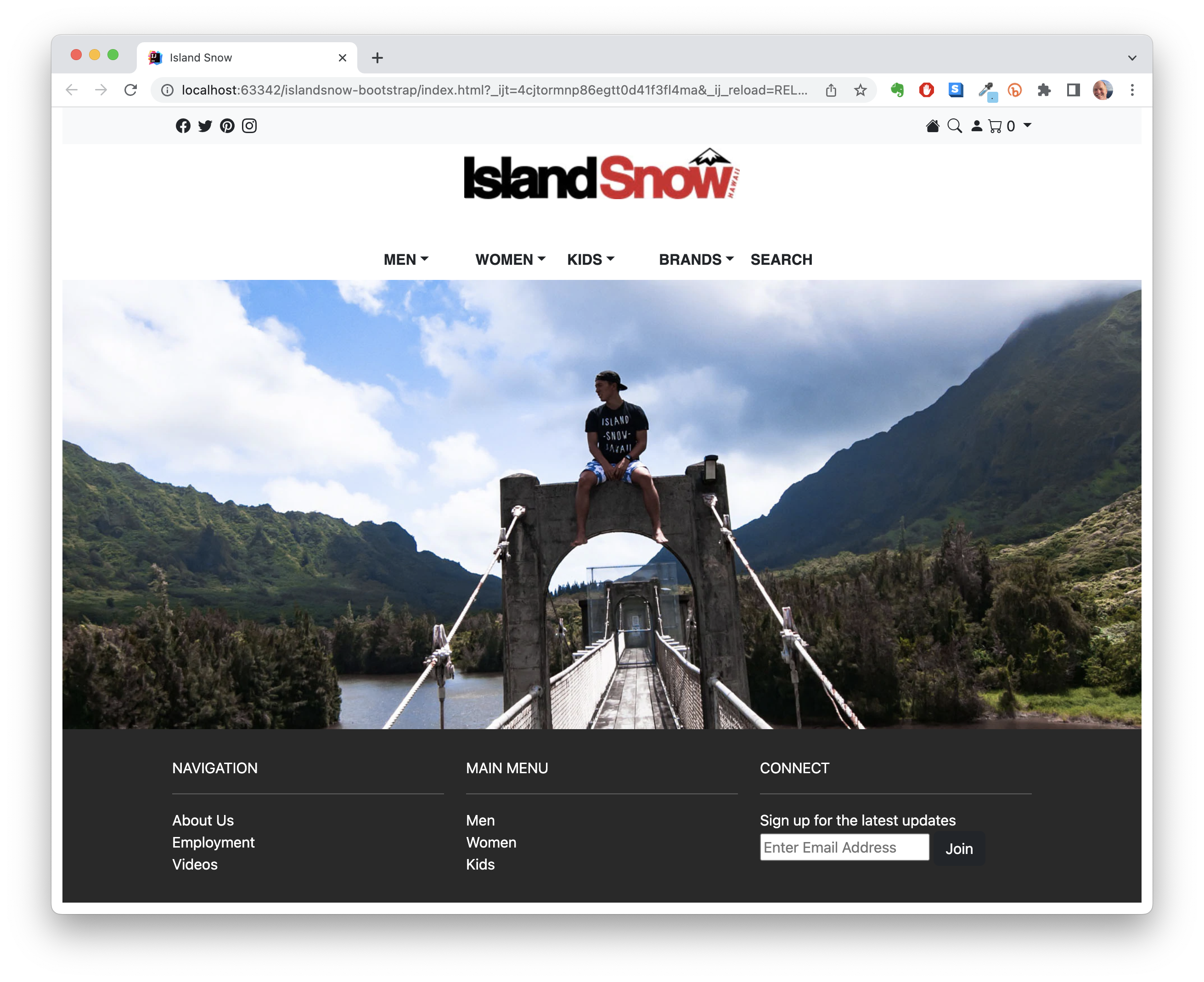
This website was developed using Bootstrap, and I would like to highlight some of the Bootstrap components integrated into its design.
Taking a look at the header, there is a well-organized display of Bootstrap icons. These icons are divided into two groups that float left and right. To create this navbar, I assigned the ‘navbar-nav’ class to my unordered list (ul) tags and used the ‘nav-item’ class for list items (li).
Moving to the bottom of the page, there exists a structured footer. The footer is constructed using a ‘footer’ tag and contains ‘div’s organized into rows and columns. To achieve this layout, I applied the ‘row’ and ‘col’ class names to select div elements.
In various parts of the website, I utilized the ‘container’ class name. This provides padding, which contributes to a visually appealing and well-spaced layout. This class appears in the navbar and footer, enhancing the overall design coherence.